

Implement a Password Strength Meter in Angular
read Mar 28, 2021 3482 reads 1 comment
Getting Started
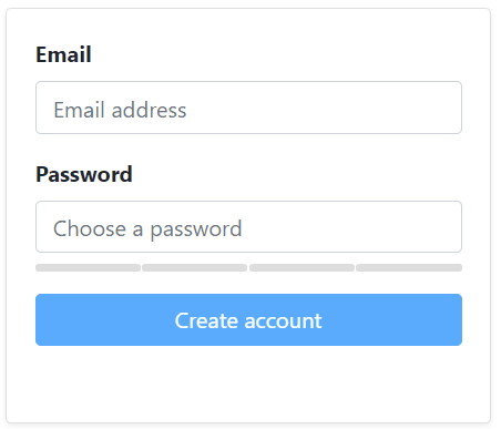
This is what we're going to build, a simple signup form with a password strength meter:
Make sure Node.js, NPM, and Angular CLI are installed. I'm using Visual Studio Code, but feel free to use your favorite editor. Let's start by creating a new project:
ng new ng-password-strength-meter --style=scss --routing=falseThis will create a new project named ng-password-strength-meter with SCSS for styling and no routing to keep things simple. I'm going to use Bootstrap for UI components, let's install that too:
npm install --save bootstrapAt the time of writing the latest Bootstrap release is on version 4.6. Next, we're going to import Bootstrap. Open src/styles.scss and add the following:
@import "~bootstrap/scss/bootstrap";I prefer importing the SCSS file because overriding variables and styles are easier this way. Alternatively, you could import the CSS file in angular.json:
"styles": [
  "node_modules/bootstrap/dist/css/bootstrap.min.css",
  "src/styles.scss"
]
Finally, let's update index.html and add some Bootstrap styling:
<body>
  <div class="container">
    <main role="main" class="py-5">
      <app-root></app-root>
    </main>
  </div>
</body>
The Signup Form
We're going to build a simple reactive form with two controls: Email, and Password. Let's start simple and go step by step. Open app.component.html and add the following markup:
<div class="row">
  <div class="col-12 col-md-4 offset-md-4">
    <!-- signup card -->
    <div class="card shadow-sm" *ngIf="!complete">
      <div class="card-body">
        <form [formGroup]="signupForm" (ngSubmit)="onSubmit()" novalidate autocomplete="off">
          <!-- form controls go here -->
        </form>
      </div>
    </div>

    <!-- success card -->
    <div class="card text-white bg-success shadow-sm h-100" *ngIf="complete">
      <div class="card-header">Registration complete</div>
      <div class="card-body">
        <h5 class="card-title">You're all set 🐉</h5>
        <p class="card-text">Check your inbox to confirm your account.</p>
      </div>
    </div>
  </div>
</div>
Basic stuff, we have a row and a column, with two cards. The signup card is displayed when the complete property is false, and the success card is displayed when the complete property is true. We want to disable the submit button until the form becomes valid and we have no validation errors. Once the user completes the form, we're going to simulate an HTTP call and display the success card. Before we continue though, let's finish the template markup. Add the following snippet inside the form element:
<div class="form-group">
  <!-- email -->
  <label for="email" class="control-label font-weight-bold">Email</label>
  <input type="email" class="form-control" formControlName="email" placeholder="Email address"
    [ngClass]="{ 'is-valid': (submitted || f.email.dirty) && !f.email.errors, 'is-invalid': (submitted || f.email.dirty) && f.email.errors }">
  <div class="invalid-feedback" *ngIf="f.email.errors">
    <span *ngIf="f.email.errors?.required">Email address is required</span>
    <span *ngIf="f.email.errors?.email">Email address is not valid</span>
  </div>
</div>

<!-- password -->
<div class="form-group">
  <label for="password" class="control-label font-weight-bold">Password</label>
  <input type="password" class="form-control" formControlName="password" placeholder="Choose a password" autocomplete="new-password"
    [ngClass]="{ 'is-valid': (submitted || f.password.dirty) && !f.password.errors, 'is-invalid': (submitted || f.password.dirty) && f.password.errors }">
  <app-password-strength [passwordToCheck]="signupForm.value.password" (passwordStrength)="onPasswordStrengthChanged($event)"></app-password-strength>

  <div class="invalid-feedback" *ngIf="f.password.errors">
    <span *ngIf="f.password.errors?.required">Password is required</span>
    <span *ngIf="f.password.errors?.minlength">Password must be at least 8 characters long</span>
  </div>
</div>

<button type="submit" class="btn btn-block btn-primary" [disabled]="signupForm.invalid || !strongPassword || working">
  {{ working ? 'Working on it...' : 'Create account' }}
</button>
We have two form groups for each control, and we're displaying validation errors using Bootstrap styling. On line 17 you can see that we're using a <app-password-strength> component that we'll build later on. Note that we're passing a string value to the component using two-way data binding, and we're handling the passwordStrength event on the component too.
Let's complete the AppComponent before we get to the password-strength component. Open app.component.ts and replace the content with the following:
import { Component } from '@angular/core';
import { FormControl, FormGroup, Validators } from '@angular/forms';

@Component({
  selector: 'app-root',
  templateUrl: './app.component.html',
  styleUrls: ['./app.component.scss'],
})
export class AppComponent {
  submitted = false;
  working = false;
  complete = false;
  strongPassword = false;

  signupForm = new FormGroup({
    email: new FormControl(null, [Validators.email, Validators.required]),
    password: new FormControl(null, [
      Validators.minLength(8),
      Validators.required,
    ]),
  });

  get f() {
    return this.signupForm.controls;
  }

  onPasswordStrengthChanged(event: boolean) {
    this.strongPassword = event;
  }

  onSubmit() {
    this.submitted = true;

    if (this.signupForm.invalid) {
      return;
    }

    this.working = true;
    setTimeout(() => {
      this.signupForm.reset();
      this.working = false;
      this.complete = true;
    }, 1000);
  }
}
We have a few properties, a FormGroup, and three simple methods. The submitted is set to true when the submit button is clicked. The working property is set to true while the app is working (calling your API) which we're going to simulate using a setTimeout() call. The complete property is set to true when the form is valid and we want to display the success card. Lastly, the strongPassword property is going to be updated by the password-strength component and reflects the password strength. If this property is true, we know we have a strong password.
The f getter is a helper method for easily accessing the form controls in the template. The onPasswordStrengthChanged method handles an event coming from the password-strength component. Finally, we have the onSubmit method which is called when the form is submitted. If the form is invalid (meaning we have validation errors), nothing happens, the method returns. Otherwise, we simulate an HTTP call, reset the form and show the success card. So far so good, now let's see the password-strength component.
The Password Strength Meter
I could implement this piece of code directly in the AppComponent, but it's always better to encapsulate reusable components. Create a folder named components under src/app. Then create another folder under it named password-strength. You could generate a new component using Angular CLI, but I find it easier to do it manually, call me old-fashioned. Create the component files:
- password-strength.component.html
- password-strength.component.ts
- password-strength.component.scss
Let's start with the template. Open password-strength.component.html and add the following:
<div class="strength">
  <ul class="strengthBar mt-2">
    <li class="point" [style.background-color]="bar0"></li>
    <li class="point" [style.background-color]="bar1"></li>
    <li class="point" [style.background-color]="bar2"></li>
    <li class="point" [style.background-color]="bar3"></li>
  </ul>

  <p class="text-center mb-0" [style.color]="messageColor" *ngIf="passwordToCheck?.length">{{ message }}</p>
</div>
We have a container element with the strength class, a list with 4 items, and a paragraph for the message. Each list item is a strength bar, so if a password is strong enough all four bars are going to be filled in. The message variable is going to display a keyword (e.g. Average, Good, etc.).
Open password-strength.component.scss and add the following rules:
.strength {
  display: flex;
  flex-direction: row;
}

.strengthBar {
  display: flex;
  flex-grow: 1;
  list-style: none;
  margin: 0;
  padding: 0;
  vertical-align: 2px;
}

.point:last-of-type {
  margin: 0 !important;
}

.point {
  background: #ddd;
  border-radius: 2px;
  display: inline-block;
  height: 5px;
  margin-right: 1px;
  flex-grow: 1;
}

p {
  font-weight: bold;
  flex-grow: 0.1;
}
Note that the container element and the strength bars are displayed as flex. The component logic is simple and straightforward too.
Open password-strength.component.ts and add the following:
import { Component, EventEmitter, Input, OnChanges, Output, SimpleChange } from '@angular/core';

@Component({
  selector: 'app-password-strength',
  styleUrls: ['./password-strength.component.scss'],
  templateUrl: './password-strength.component.html',
})
export class PasswordStrengthComponent implements OnChanges {
  bar0: string;
  bar1: string;
  bar2: string;
  bar3: string;

  @Input() public passwordToCheck: string;

  @Output() passwordStrength = new EventEmitter<boolean>();

  private colors = ['darkred', 'orangered', 'orange', 'yellowgreen'];

  message: string;
  messageColor: string;

  checkStrength(password: string) {
    // 1
    let force = 0;

    // 2
    const regex = /[$-/:-?{-~!"^_@`\[\]]/g;
    const lowerLetters = /[a-z]+/.test(password);
    const upperLetters = /[A-Z]+/.test(password);
    const numbers = /[0-9]+/.test(password);
    const symbols = regex.test(password);

    // 3
    const flags = [lowerLetters, upperLetters, numbers, symbols];

    // 4
    let passedMatches = 0;
    for (const flag of flags) {
      passedMatches += flag === true ? 1 : 0;
    }

    // 5
    force += 2 * password.length + (password.length >= 10 ? 1 : 0);
    force += passedMatches * 10;

    // 6
    force = password.length <= 6 ? Math.min(force, 10) : force;

    // 7
    force = passedMatches === 1 ? Math.min(force, 10) : force;
    force = passedMatches === 2 ? Math.min(force, 20) : force;
    force = passedMatches === 3 ? Math.min(force, 30) : force;
    force = passedMatches === 4 ? Math.min(force, 40) : force;

    return force;
  }

  ngOnChanges(changes: { [propName: string]: SimpleChange }): void {
    const password = changes.passwordToCheck.currentValue;

    this.setBarColors(4, '#DDD');

    if (password) {
      const color = this.getColor(this.checkStrength(password));
      this.setBarColors(color.index, color.color);

      const pwdStrength = this.checkStrength(password);
      pwdStrength === 40 ? this.passwordStrength.emit(true) : this.passwordStrength.emit(false);

      switch (pwdStrength) {
        case 10:
          this.message = 'Poor';
          break;
        case 20:
          this.message = 'Not Good';
          break;
        case 30:
          this.message = 'Average';
          break;
        case 40:
          this.message = 'Good';
          break;
      }
    } else {
      this.message = '';
    }
  }

  private getColor(strength: number) {
    let index = 0;

    if (strength === 10) {
      index = 0;
    } else if (strength === 20) {
      index = 1;
    } else if (strength === 30) {
      index = 2;
    } else if (strength === 40) {
      index = 3;
    } else {
      index = 4;
    }

    this.messageColor = this.colors[index];

    return {
      index: index + 1,
      color: this.colors[index],
    };
  }

  private setBarColors(count: number, color: string) {
    for (let i = 0; i < count; i++) {
      (this as any)['bar' + i] = color;
    }
  }
}
Let's go through the code. We have an @Input property, which is bound to the password control on the form. Then we have an @Output event that is going to emit boolean values. The colors property is an array of strings that defines four colors for the strength bars. You could change these to whatever colors you like.
The component implements the OnChanges interface to listen to change events. In the ngOnChanges method:
- We get the current value of the password control
- We reset the bar colors
- If the password is empty, we clear out the message
- If not, we get the password strength by calling the
checkStrengthmethod - If the strength equals 40 (strong password) we emit true, otherwise false
- Then we set the bar colors using the
getColorandsetBarColorsmethods - Finally, using a
switchstatement we check the strength and set the message
The getColor method is self-explanatory, we just get the color index based on the strength value, and extract the color from the colors array.
The setBarColors method sets a new color on the bar properties defined on the component. I've tried to keep it simple for demo purposes, but you could refactor these methods.
The checkStrength method is where interesting things happen. We're matching the input string against regular expressions. We have 4 RegEx patterns and we want to check whether the password:
- Contains lowercase letters
- Contains uppercase letters
- Contains digits
- Contains special characters
Based on the RegEx results, coupled with the input length, we get a number and store it in the force variable. And finally, based on the force value, we return a number ranging from 10 to 40, since we have four RegEx patterns to match. So if we get a 10, it means the input is a weak password and if we get 40, it means all four RegEx patterns have matched. On the UI we have four bars that change color based on the strength value. This is a flexible implementation and you could add your own custom rules. If you wanted to match the input against 6 RegEx patterns, you'd have six bars and the strength value would range from 10 to 60. I'll leave that to you to play with the demo and implement your own requirements.
Points of Interest
Although you could use this implementation in production, there's room for improvement. For instance, you could develop a custom validator and use it on the FormGroup. Currently, the submit button is disabled if the password is weak, but it'd be better to get a nice validation error on the form control. Additionally, you could change the UI layout and display the strength meter in a popup component. Also, the component is not dependent on Bootstrap or any UI framework, so feel free to change the UI as you see fit. The good thing is that we're using regular expressions to validate the password, which means you could implement your custom business rules and achieve what you need.
Source Code
You can get the complete code on Github. I've also created a demo app on Stackblitz for you to play with. Happy coding.
Updated at Mar 28, 2021

1 Reply
Emerald
2/12/2024Amazing work! this content is really and filled with the right information needed. Get more of this at my webpage.