

Password Validation with Reactive Forms
read Mar 21, 2021 13431 reads 1 comment
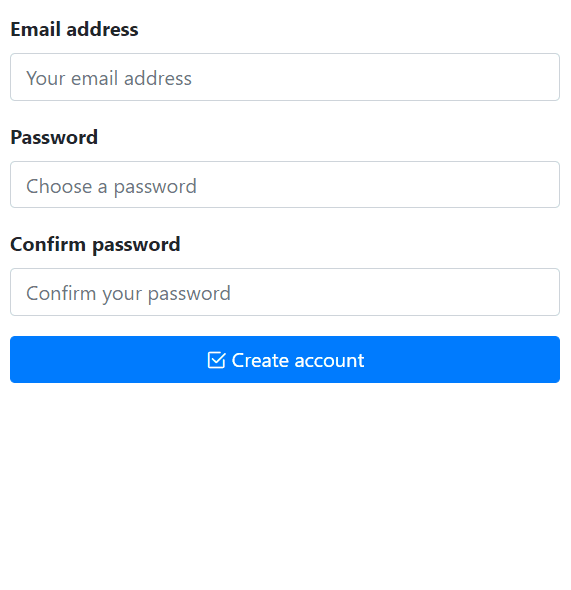
I'm using the latest version of Angular, but you should be able to use the same code in previous releases. I'm assuming you have a basic understanding of Angular and Bootstrap, but even if you're new to Angular it shouldn't be hard to follow along. Before we get started, this is how the end result is going to look like.
In this demo, we're going to use Bootstrap 4.6 and Bootstrap Icons 1.4 for the user interface. Feel free to use the UI framework of your choice.
Getting Started
First, let's create a new Angular CLI project. Assuming you have Node.js, npm and Angular installed, execute the following command in your terminal (I'm on Windows and using PowerShell).
ng new ng-password-validation-example --style=scss --routing=falseThis will create a new Angular project using SCSS styling, and no routing. Next, we install Bootstrap as our UI library. I'm using npm but you could use the package manager of your choice, like yarn.
npm install --save bootstrapNext, we're going to import Bootstrap. I'm going to import the SCSS file directly, open src/styles.scss and add the following import:
@import "~bootstrap/scss/bootstrap";Alternatively, you could update your angular.json file and add it to the styles section. Note that Bootstrap is imported before the application styles, otherwise, your overrides won't work 🤺.
"styles": [
  "node_modules/bootstrap/scss/bootstrap.scss"
  "src/styles.scss"
]
Now we need an icon pack. I'm going to use Bootstrap Icons, but you could use FontAwesome, Material Icons, or any other. To keep things simple, I'll import it via CDN. Open src/index.html and add the following link in the head section:
<link rel="stylesheet" href="https://cdn.jsdelivr.net/npm/bootstrap-icons@1.4.0/font/bootstrap-icons.css">Lastly, we need to import the Reactive Forms Module since we're going to build a reactive form. Open app.module.ts and import the module:
import { NgModule } from "@angular/core";
import { BrowserModule } from "@angular/platform-browser";
import { ReactiveFormsModule } from "@angular/forms";

import { AppComponent } from "./app.component";

@NgModule({
  imports: [BrowserModule, ReactiveFormsModule],
  declarations: [AppComponent],
  bootstrap: [AppComponent]
})
export class AppModule { }
Great, we have all we need in place. Now let's talk about custom validators before we build the signup form.
Building Custom Validators
Angular provides built-in validators, and they're great for common use cases. But they're not going to help us achieve our requirements. We need a custom validator that uses RegEx (regular expression) to check individual rules and report back to us. So our custom validator needs to accept a RegEx, and a validation error object to return. For instance, if we wanted to check whether a string contains a digit or not, we want to write something like this:
patternValidator(/\d/, { hasNumber: true }),Here, the method name is patternValidator. We're passing in the /\d/ regular expression and the second argument is the error object. Meaning if the target string didn't have a digit, the hasNumber error will be set on the form control. In the component template, we can check for control errors like control.hasError('hasNumber'). Nothing fancy here, basic stuff. Next, we'll create a class named PasswordValidators where we'll define our custom validation. Create the class manually, or use the Angular CLI:
ng g class password-validatorsAll we need is a static method that accepts a regular expression and an error object. We're going to use the same method for each password rule, passing in different regular expressions. Here's the class definition:
import { AbstractControl, ValidationErrors, ValidatorFn } from "@angular/forms";

export class PasswordValidators {
  constructor() {}

  static patternValidator(regex: RegExp, error: ValidationErrors): ValidatorFn {
    return (control: AbstractControl): { [key: string]: any } => {
      if (!control.value) {
        // if the control value is empty return no error.
        return null;
      }

      // test the value of the control against the regexp supplied.
      const valid = regex.test(control.value);

      // if true, return no error, otherwise return the error object passed in the second parameter.
      return valid ? null : error;
    };
  }
}
We also need a validator to check whether the password and confirm password values match. Add the following method to the class:
  static MatchValidator(control: AbstractControl) {
    const password: string = control.get("password").value; // get password from our password form control
    const confirmPassword: string = control.get("confirmPassword").value; // get password from our confirmPassword form control

    // if the confirmPassword value is null or empty, don't return an error.
    if (!confirmPassword?.length) {
      return null;
    }

    // if the confirmPassword length is < 8, set the minLength error.
    if (confirmPassword.length < 8) {
      control.get('confirmPassword').setErrors({ minLength: true });
    } else {
      // compare the passwords and see if they match.
      if (password !== confirmPassword) {
        control.get("confirmPassword").setErrors({ mismatch: true });
      } else {
        // if passwords match, don't return an error.
        return null;
      }
    }
  }
Let's see what's happening in this method. First, we get the control values. If the confirm password is empty, we return null, meaning no errors were found. This is because the confirm password control is going to have additional validators defined on the FormGroup, we don't want to override them here. Next, we check the confirm password's length. If it's less than 8 characters long, we set the minLength error on the control. This is another validation rule defined on the form, which I'll get to in a minute. Lastly, if we have a value, we check whether the passwords match or not. If not, we set the mismatch error on the control, otherwise, we return null which means they do match. The error names are arbitrary, you could name them whatever you like.
Building the Signup Form
To keep things simple and to the point, we're going to use the AppComponent itself. Open src/app/app.component.ts and update the class definition as follows:
import { Component } from "@angular/core";
import { FormControl, FormGroup, Validators } from "@angular/forms";
import { PasswordValidators } from "./password-validators";

@Component({
  selector: "my-app",
  templateUrl: "./app.component.html",
  styleUrls: ["./app.component.scss"]
})
export class AppComponent {
  submitted = false;
  isWorking = false;

  signupForm = new FormGroup(
    {
      email: new FormControl(null, [Validators.email, Validators.required]),
      password: new FormControl(
        null,
        Validators.compose([
          Validators.required,
          Validators.minLength(8),
          PasswordValidators.patternValidator(new RegExp("(?=.*[0-9])"), {
            requiresDigit: true
          }),
          PasswordValidators.patternValidator(new RegExp("(?=.*[A-Z])"), {
            requiresUppercase: true
          }),
          PasswordValidators.patternValidator(new RegExp("(?=.*[a-z])"), {
            requiresLowercase: true
          }),
          PasswordValidators.patternValidator(new RegExp("(?=.*[$@^!%*?&])"), {
            requiresSpecialChars: true
          })
        ])
      ),
      confirmPassword: new FormControl(null, [
        Validators.required,
        Validators.minLength(8)
      ])
    },
    {
      validators: PasswordValidators.MatchValidator
    }
  );

  // convenience getter for easy access to form controls
  get f() {
    return this.signupForm.controls;
  }

  get passwordValid() {
    return this.signupForm.controls["password"].errors === null;
  }

  get requiredValid() {
    return !this.signupForm.controls["password"].hasError("required");
  }

  get minLengthValid() {
    return !this.signupForm.controls["password"].hasError("minlength");
  }

  get requiresDigitValid() {
    return !this.signupForm.controls["password"].hasError("requiresDigit");
  }

  get requiresUppercaseValid() {
    return !this.signupForm.controls["password"].hasError("requiresUppercase");
  }

  get requiresLowercaseValid() {
    return !this.signupForm.controls["password"].hasError("requiresLowercase");
  }

  get requiresSpecialCharsValid() {
    return !this.signupForm.controls["password"].hasError("requiresSpecialChars");
  }

  onSubmit() {
    this.submitted = true;

    if (this.signupForm.invalid) {
      return;
    }

    this.isWorking = true;
    this.signupForm.disable();

    setTimeout(() => {
      this.isWorking = false;
      this.signupForm.enable();
    }, 1500);
  }
}
Nothing special going on, but let's see what we're doing here. First, we import FormControl, FormGroup, and Validators from @angular/forms. We also import the PasswordValidators class we just created. Then we define two properties on the component: submitted, and isWorking. The submitted property is used to check whether the form has been submitted or not. And the isWorking property is used to simulate an HTTP call (communicating with your API, creating an account, etc.). When you click the submit button, if the form is valid, we're going to disable the form, simulate a loading state, and reenable the form.
The signupForm is a FormGroup composed of three controls: email, password, and confirmPassword. All three controls have a default value of null, this is important. If you were to set the default values to an empty string, the validators could behave unexpectedly. It's always best to set the default control values to null. The email control is simple and straightforward, it has two validators: email, and required. The confirmPassword control is simple too, it has two validators: required, and minLength(8). The password control is the interesting part. We're composing an array of validators using the Validators.compose method. The first two validators are built-in, required, and minLength. Then we define four custom validators using the static method we created. For each validation rule, we pass in a regular expression, and an error object to be set on the control if the RegExp didn't match. Right after the minLength validator, we define these rules:
- requiresDigit - the password must contain at least one digit
- requiresUppercase - the password must contain at least one uppercase letter
- requiresLowercase - the password must contain at least one lowercase letter
- requiresSpecialChars - the password must contain at least one special character
Lastly, we define a validator on the FormGroup itself for checking whether the passwords match or not:
// control definitions removed for brevity.
signupForm = new FormGroup(
  {
    email: new FormControl(),
    password: new FormControl(),
    confirmPassword: new FormControl()
  },
  {
    // FormGroup validators go here.
    validators: PasswordValidators.MatchValidator
  }
);
So far so good, we have created the signup form and defined our custom validators. Before we continue to the component template, we need some helper methods. This step is not necessary, you could achieve the same thing right in the template code. But that would be messy and clutters your markup. We need a few helper methods to easily access form controls and get the status of validation errors. Add the following methods to the AppComponent class:
// convenience getter for easy access to form controls
get f() {
  return this.signupForm.controls;
}

get passwordValid() {
  return this.signupForm.controls["password"].errors === null;
}

get requiredValid() {
  return !this.signupForm.controls["password"].hasError("required");
}

get minLengthValid() {
  return !this.signupForm.controls["password"].hasError("minlength");
}

get requiresDigitValid() {
  return !this.signupForm.controls["password"].hasError("requiresDigit");
}

get requiresUppercaseValid() {
  return !this.signupForm.controls["password"].hasError("requiresUppercase");
}

get requiresLowercaseValid() {
  return !this.signupForm.controls["password"].hasError("requiresLowercase");
}

get requiresSpecialCharsValid() {
  return !this.signupForm.controls["password"].hasError("requiresSpecialChars");
}
The first one is a convenient method for easily accessing form controls. The other methods, return a boolean for each validation rule. For instance, the requiresDigitValid method returns true if the password control doesn't have the requiresDigit error.
Component Template
Let's start with the layout, since we're using Bootstrap we need a basic layout to display our form. Open src/app/app.component.html and add the following markup:
<div class="container">
  <div class="row mt-3">
    <div class="col">
      <!-- signup form goes here -->
    </div>
  </div>
</div>
We have a fixed container, a row with some top margin, and a single column. Next, we create a reactive form element as you normally would:
<form [formGroup]="signupForm" (ngSubmit)="onSubmit()" novalidate autocomplete="off">
  <!-- form controls go here -->
</form>
The form is bound to the signupForm FormGroup defined in the component class. And the submit event is bound to the onSubmit method, which we'll define later on. For each form control, we define a Bootstrap form-group element, like so:
<!-- email address -->
<div class="form-group">
  <label for="email" class="control-label font-weight-bold">Email address</label>
  <input type="email" class="form-control" formControlName="email" placeholder="Your email address"
    [ngClass]="{ 'is-valid': (f.email.dirty || submitted) && !f.email.errors, 'is-invalid': (f.email.dirty || submitted) && f.email.errors }" />

  <div class="invalid-feedback">
    <span class="text-danger" *ngIf="f.email.errors?.required">Email address is required</span>
    <span class="text-danger" *ngIf="f.email.errors?.email">Email address is not valid</span>
  </div>
</div>
Pretty straightforward, but let's examine the code. Each form control has a label and an input field. The input fields are bound to the FormGroup using the formControlName directive. For validation feedback, we use Bootstrap to toggle CSS classes. The [ngClass] directive is used to add the appropriate class to the input fields. The is-valid class is added if the form control is dirty, or if the form has been submitted, but there were no errors on the control. Similarly, the is-invalid class is added if there are errors on the form control. The invalid-feedback block is from Bootstrap, and we simply display error messages for individual errors using the ngIf directive. Great, that was easy. Now let's see the custom validation UI.
Password Rules Validation UI
What we want to do is, first check whether we have a password or not. If not, we want to display a required error message. If we do have a password, display the UI for our custom validation rules. This is the markup for the password control:
<!-- password -->
<div class="form-group">
  <label for="password" class="control-label font-weight-bold">Password</label>
  <input type="password" formControlName="password" class="form-control" name="password" placeholder="Choose a password"
    [ngClass]="{ 'is-valid': (f.password.dirty || submitted) && passwordValid, 'is-invalid': (f.password.dirty || submitted) && !passwordValid }" />
  <div class="invalid-feedback">
    <!-- required -->
    <span class="text-danger" *ngIf="(f.password.dirty || submitted) && !requiredValid">Password is required</span>

    <!-- password validation rules -->
    <div class="mt-3" *ngIf="requiredValid">
      <!-- minlength -->
      <div [ngClass]="{ 'text-success': minLengthValid, 'text-danger': !minLengthValid }">
        <i [attr.class]="minLengthValid ? 'bi-check-square-fill' : 'bi-x-square'"></i>
        Must be at least 8 characters long
      </div>

      <!-- requires digit -->
      <div [ngClass]="{ 'text-success': requiresDigitValid, 'text-danger': !requiresDigitValid }">
        <i [attr.class]="requiresDigitValid ? 'bi-check-square-fill' : 'bi-x-square'"></i>
        Must contain at least 1 digit
      </div>

      <!-- requires uppercase -->
      <div [ngClass]="{ 'text-success': requiresUppercaseValid, 'text-danger': !requiresUppercaseValid }">
        <i [attr.class]="requiresUppercaseValid ? 'bi-check-square-fill' : 'bi-x-square'"></i>
        Must contain at least 1 uppercase character
      </div>

      <!-- requires lowercase -->
      <div [ngClass]="{ 'text-success': requiresLowercaseValid, 'text-danger': !requiresLowercaseValid }">
        <i [attr.class]="requiresLowercaseValid ? 'bi-check-square-fill' : 'bi-x-square'"></i>
        Must contain at least 1 lowercase character
      </div>

      <!-- requires special characters -->
      <div [ngClass]="{ 'text-success': requiresSpecialCharsValid, 'text-danger': !requiresSpecialCharsValid }">
        <i [attr.class]="requiresSpecialCharsValid ? 'bi-check-square-fill' : 'bi-x-square'"></i>
        Must contain at least 1 special character
      </div>
    </div>
  </div>
</div>
If you follow the inline comments you can see that it's all self-explanatory. But let's see what's going on here. The label and the input field are the same as the other controls, nothing special. Then we have the invalid-feedback block, which is the container for validation errors. First, we check whether we have a password or not:
<!-- required -->
<span class="text-danger" *ngIf="(f.password.dirty || submitted) && !requiredValid">Password is required</span>
If the password control is empty, we want to display this error message and hide the others. Following that, we have another block that wraps the custom validation rules UI. I'll include just one of them here:
<!-- password validation rules -->
<div id="validation-rules" class="mt-3" *ngIf="requiredValid">
  <!-- minlength -->
  <div [ngClass]="{ 'text-success': minLengthValid, 'text-danger': !minLengthValid }">
    <i [attr.class]="minLengthValid ? 'bi-check-square-fill' : 'bi-x-square'"></i>
    Must be at least 8 characters long
  </div>

  <!-- other validation rules removed for brevity -->
</div>
The validation-rules block is only displayed if we have a password, but the requirements aren't met. For each validation rule, we use our helper methods to see if we have an error or not. And based on that, we display an icon and a message. If there's an error, we use the text-danger (from Bootstrap) class to have the error message in red. Otherwise, we use the text-success class to have the message in green. For the icons, we use the <i> tag, and based on the validation status, we toggle the icon class name. Here's the complete code for the component template:
<div class="container">
  <div class="row mt-3">
    <div class="col">
      <form [formGroup]="signupForm" (ngSubmit)="onSubmit()" novalidate autocomplete="off">
        <!-- email address -->
        <div class="form-group">
          <label for="email" class="control-label font-weight-bold">Email address</label>
          <input type="email" class="form-control" formControlName="email" placeholder="Your email address"
            [ngClass]="{ 'is-valid': (f.email.dirty || submitted) && !f.email.errors, 'is-invalid': (f.email.dirty || submitted) && f.email.errors }" />
          <div class="invalid-feedback">
            <span class="text-danger" *ngIf="f.email.errors?.required">Email address is required</span>
            <span class="text-danger" *ngIf="f.email.errors?.email">Email address is not valid</span>
          </div>
        </div>

        <!-- password -->
        <div class="form-group">
          <label for="password" class="control-label font-weight-bold">Password</label>
          <input type="password" formControlName="password" class="form-control" name="password" placeholder="Choose a password"
            [ngClass]="{ 'is-valid': (f.password.dirty || submitted) && passwordValid, 'is-invalid': (f.password.dirty || submitted) && !passwordValid }" />
          <div class="invalid-feedback">
            <!-- required -->
            <span class="text-danger" *ngIf="(f.password.dirty || submitted) && !requiredValid">Password is required</span>

            <!-- password validation rules -->
            <div id="validation-rules" class="mt-3" *ngIf="requiredValid">
              <!-- minlength -->
              <div [ngClass]="{ 'text-success': minLengthValid, 'text-danger': !minLengthValid }">
                <i [attr.class]="minLengthValid ? 'bi-check-square-fill' : 'bi-x-square'"></i>
                Must be at least 8 characters long
              </div>

              <!-- requires digit -->
              <div [ngClass]="{ 'text-success': requiresDigitValid, 'text-danger': !requiresDigitValid }">
                <i [attr.class]="requiresDigitValid ? 'bi-check-square-fill' : 'bi-x-square'"></i>
                Must contain at least 1 digit
              </div>

              <!-- requires uppercase -->
              <div [ngClass]="{ 'text-success': requiresUppercaseValid, 'text-danger': !requiresUppercaseValid }">
                <i [attr.class]="requiresUppercaseValid ? 'bi-check-square-fill' : 'bi-x-square'"></i>
                Must contain at least 1 uppercase character
              </div>

              <!-- requires lowercase -->
              <div [ngClass]="{ 'text-success': requiresLowercaseValid, 'text-danger': !requiresLowercaseValid }">
                <i [attr.class]="requiresLowercaseValid ? 'bi-check-square-fill' : 'bi-x-square'"></i>
                Must contain at least 1 lowercase character
              </div>

              <!-- requires special characters -->
              <div [ngClass]="{ 'text-success': requiresSpecialCharsValid, 'text-danger': !requiresSpecialCharsValid }">
                <i [attr.class]="requiresSpecialCharsValid ? 'bi-check-square-fill' : 'bi-x-square'"></i>
                Must contain at least 1 special character
              </div>
            </div>
          </div>
        </div>

        <!-- confirm password -->
        <div class="form-group">
          <label for="confirmPassword" class="control-label font-weight-bold">Confirm password</label>
          <input type="password" formControlName="confirmPassword" class="form-control" name="confirmPassword" placeholder="Confirm your password"
            [ngClass]="{ 'is-valid': (submitted || f.confirmPassword.dirty) && !f.confirmPassword.errors, 'is-invalid': (submitted || f.confirmPassword.dirty) && f.confirmPassword.errors }">
          <div class="invalid-feedback" *ngIf="(submitted || f.confirmPassword.dirty) && f.confirmPassword.errors">
            <div *ngIf="f.confirmPassword.errors.required">Confirm your password</div>
            <div *ngIf="f.confirmPassword.errors.minLength">Password must be at least 8 characters long</div>
            <div *ngIf="f.confirmPassword.errors.mismatch">Passwords do not match</div>
          </div>
        </div>

        <!-- submit button -->
        <div class="form-group">
          <button type="submit" class="btn btn-block btn-primary" [disabled]="isWorking">
            <i [attr.class]="isWorking ? 'bi-hourglass-split' : 'bi-check2-square'"></i> {{ isWorking ? 'Working on it...' : 'Create account' }}
          </button>
        </div>
      </form>
    </div>
  </div>
</div>
Now we need the submit handler. Add the onSubmit method to src/app/app.component.ts:
onSubmit() {
  this.submitted = true;

  if (this.signupForm.invalid) {
    return;
  }

  this.isWorking = true;
  this.signupForm.disable();

  setTimeout(() => {
    this.isWorking = false;
    this.signupForm.enable();
  }, 1500);
}
First, we set the submitted property to true. This demo allows you to click the submit button to get the validation errors. Alternatively, you could disable the submit button until all validation requirements are met. Next, if the form is invalid (meaning there are errors on the form), the method returns, nothing happens. If the form is valid, we simulate an HTTP call. You'd call your API here, etc.
Demo and Source Code
That's it! Pretty cool. Angular is a powerful framework, and very flexible. You could use the same technique to implement your custom validation logic and enforce your business rules. If you want to learn more about form validation in Angular, have a look at these pages:
You can find a demo to play with over here and see the complete code on StackBlitz.
Updated at Mar 21, 2021

1 Reply
rudra
7/12/2023amazing